Doom Interactive Poster
ARTG-80G Interactive Poster
Walkthrough:
Volume Warning! Some noises may get a bit loud
Clickable Areas:
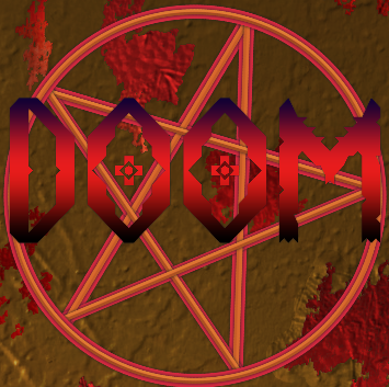
- DOOM Logo
- Pentagram (Top or Bottom half. Around the Doom logo)
- Reset Button
- Credits Button *Note: Due to the way browsers work, the credits may not display for the full 3 seconds every time. If you click on it, wait a few seconds before clicking on it again*
- Monsters
Design Goals:
With Doom being one of my favorite games, I knew that I wanted to have it be the subject of my poster. I wanted to combine aspects of the newer games with the classic ones. The idea started with the intro syncing up to the title music for Doom 2016. I liked the idea of the flashy, big and bold text contrasting a dark background. The font that I use there, which I also use for the other buttons and the credits text, was chosen because it has a futuristic sense to it, which is a big part of the Doom franchise.
Moving to the Logo, I didn’t want to directly copy the Doom Logo because I wanted to have some parts of the poster be unique from the game. I made a font in FontStruct, but really only enough to spell ‘DOOM’. I designed it to start with a more slick and futuristic looking font with the ‘D’. I wanted it to get more mangled and hellish as the letters move along, with the ‘O’s being more cryptic looking and finally, the ‘M’ looking mangled and monster-ish. The spinning pentagram in the background was the first thing I worked on and was something I knew I wanted from the beginning. It captures much of the essence of Doom and sells the idea that it has something to do with Hell.
I wanted there to be some sort of gameplay aspect to the poster. Originally, I wanted monsters to pop up randomly for the player to shoot, but due to my limited knowledge of JavaScript and P5, I decided to opt for a more controlled route. I decided that clicking on the Doom Logo would be a good way to start the minigame, allowing the player to control the replayability of the poster and not constantly be begrudged by monsters constantly popping up. I was originally going to resize the logo if it was hovered over, but that caused too much lag, so I opted for changing the colors so that the player would know that it was a button. Of course, the only way to get rid of the monsters is to shoot them, which was also a great excuse to add some sound effects from the classic games. The crosshair cursor I think also aids the player in knowing that that is the only responsible action to take in the case of a monster breakout. The monsters are traces of the Imp and Zombieman from the original Doom games.
The background is something I’m rather proud of. I originally wanted to replicate one of the walls in the original Doom game, but my artistic abilities hindered that a bit. To get the texturing that I wanted, I took a picture of my apartment wall and put a color overlay on it to give the brown, worn down look. I also was able to use the texturing to help shape the blood splatters on it. I knew I wanted the pentagram to do something and after much thought, I decided to connect it to the background and make it so that the more you click on it, the more blood appears on the background, which I think, once again, captures much of the essence of Doom.
Finally, I knew I wanted a way to replay the experience. The reset button was something I wanted from the start as well. I wanted it to be somewhat low-key, but also have enough of a presence so that it’s not missed by the player. Using some beveling in photoshop, I think I got it working. I did the same for the credits, which I only wanted to activate for a few seconds as to not get in the way of the user experience. Resizing the buttons when hovered over was once again a way to let the player know that the buttons are useable.
Leave a comment
Log in with itch.io to leave a comment.